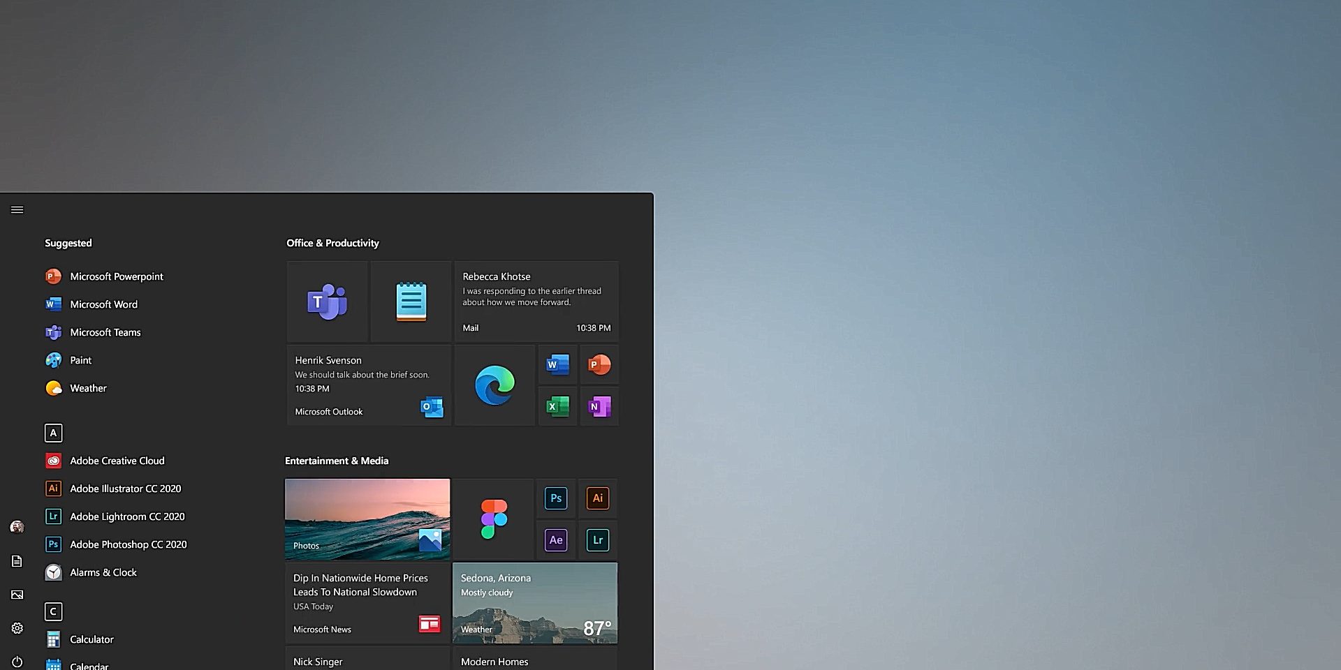
A while back Microsoft revealed a new start menu. Lets take a look at the new Start Menu!
At first you will see that the accent colors are gone. The tiles will now be either gray or white depending on you color scheme. This fits better with the new icons and is also easier to look at.
The new Windows 10 Start Menu has been revealed!
The new Windows 10 start menu will still feature live tiles. Many thought they would be removed entirely just like in Windows 10X but they stayed for the normal Windows 10 version. Also the icons of all apps no longer have a background tile behind them what makes the start menu look more clean and less clunky. And a long requested feature will finally been added to Windows 10. Transparent tiles! And they look gorgeous. What do you think? You like the more cleaner Start Menu or is it just boring?


